Restaurant Signage ideas to promote your establishment in Melbourne, FL
Fresh and trending restaurant signage ideas to promote your establishment are now more important than ever, in the aftermath of Covid-19. Everyone has gone through a huge shift in their social lives and is looking for a normal dining culture again. Professional Restaurant Signage can aid your guests throughout this process. As your local sign company we have prepared a list of ideas to promote your restaurant in Melbourne, FL with Outdoor Business Signage.
Restaurant Signage Design Ideas
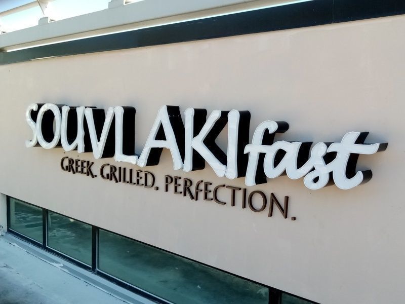
Impressive Restaurant Signage will make your restaurant stand out and entice potential customers to come inside and dine with you. Furthermore, outdoor restaurant signs provide an opportunity to create brand awareness and enhance your marketing efforts. Signs for restaurants are being used to advertise a grand opening, a special promotion or a new menu item. As your local sign company in Melbourne, FL we’ll show you how to advertise your restaurant effectively with custom signage.
1. Use contrasting colors
When investing in restaurant signage, you want to make sure that your message is visible and readable. Using contrasting colors will help with that. When referring to contrasting colors, they’ll either be dark colors on a light background or light colors on a dark background. Be careful with light colored texts like yellow or light green as this can negatively affect the readability.
2. Use stimulating colors
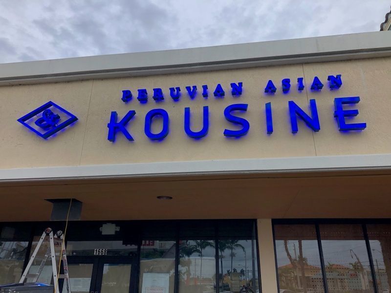
While we are on the topic of colors, it’s important to use stimulating and attention-grabbing colors. An example of a stimulating color is red, which is often used in restaurant signage as it’s exciting, energetic and believed to stimulate the appetite. Also, avoid using too many different colors at once. A rainbow of colors confuses viewers and detracts from the message. Lastly, choose colors that relate to you what you’re selling.
3. Simplicity is the key
Visual clutter can cause potential customers to turn away, as most people only allow a few seconds to read a billboard or sign. Therefore, include the minimum number of words on your promotional sign, and make sure your sign is easy to understand.
4. Big, bigger, biggest
Last but not least, size is the key to effective signage. Make sure your sign is large enough that people can easily read it as they walk or drive by. Depending on the speed of passerby’s you can adjust the size of your sign. In general motorists have less time to read a sign, compared to a pedestrian, asking for large signage & lettering.
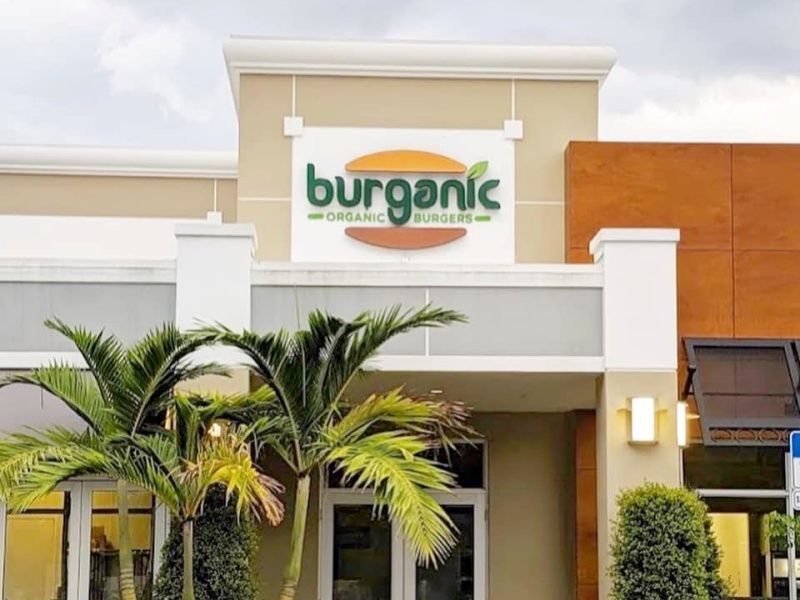
Restaurant Signage in Melbourne, FL
At Sign Partners, we are always looking for the latest trends when it comes to signage to make your restaurant stand out. Our professional team of graphic designers can design restaurant signage that is effective and in line with your branding. As your local sign company, we are located in Melbourne, FL serving Central & South Florida.
Are you ready to brainstorm about ideas for your Restaurant Signage? Call Sign Partners at (321) 600-4700 or request a quote here.

