Don't have a lobby? We recommend 4 places to put your interior lobby sign

When you are designing your office space, remember that everything reflects your business. From the positioning of your desks to the receptionist at the entrance—they speak volumes to the quality you are going to offer your clients. Lack of space is no excuse to leave an interior sign off of your check list. They can be critical to office branding. If you have a great name or logo, don’t reserve it for letterhead and business cards only. Post it up boldly so your customers identify you from the minute they walk into your business.
Signs are also great for welcoming your clients. They say “You are exactly where you need to be to receive the premiere customer service we offer.” What better way to welcome your paying customers who are loyal to your brand? A good lobby sign can also decorate a space. If you have a catchy name or a creative logo, work it into the interior design of your office.
Even if you don’t have an official lobby area, you can still get your message across in another area. We recommend 4 other places which are great locations for a lobby sign.
RECEPTION
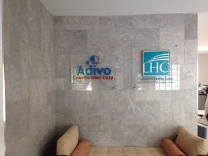
Your reception area should effectively communicate your brand. Consider that every new customer comes through this area. This is also where you greet your customers. What better way to start the association of quality care and your brand? Put the sign at your reception area. Coupling it with an inviting and warm receptionist, and you’ll immediately have a great impact on your existing and potential clients.
WAITING ROOM
Some businesses have an area for customers to wait comfortably, like a doctors practice. This is the perfect area for signage since people will be there anyway! Most people assess their surroundings when they are waiting- it’s a normal reaction. Take advantage of that curiosity by posting a wall graphic or lobby office sign.

SHOWROOM
If you have a showroom, this is another area where your signs will go a long way in conveying your message. In a showroom area people are naturally walking around and looking intently. They are alert and looking for things to focus on. This is the perfect location to post a sign. It reminds them that all the wonderful products they are browsing through are part of your premiere line.
THE FIRST-SIGHT
Some businesses are short on space and don’t have any semblance of a lobby. You still have an entrance though. Whatever first-sight area you have at your entrance, take advantage of it. Take a visual assessment of your visitor’s perspective when they walk in and choose an office sign that is appropriate to it.
Regardless of how much space you have at your office, take advantage of open areas to make the most of your brand. Remember that you always want to communicate your message and identity effectively-- from the moment your customer enters the building to the moment they leave. Signs are the perfect way to do just that!


